UI
Building a Dashboard Layout Using CSS Grid
Learn how CSS Grid provides a powerful, native solution for building efficient dashboard layouts...
Jun 21, 2024 • 4 mins reading
In the world of web development, creating a consistent design across various platforms and teams can be quite challenging. Imagine trying to keep the same colors, fonts, and spacing across all the different parts of your application. This is where design tokens go to the rescue.
Design tokens are like building blocks for your design system. They store values for design elements such as colors, spacing, and typography in a single, centralized place. Think of them as a way to keep all your design choices organized and easily accessible. By using design tokens, you can ensure that your design remains consistent and easy to manage, no matter how large your project grows.
In this post, we'll explore what design tokens are, why they're useful, and how you can use them with Tailwind CSS to create a cohesive and maintainable design system.
Design tokens are the essential building blocks of a design system. They are values that represent design decisions and help in maintaining a consistent look and feel throughout your application. These tokens can include:
Think of design tokens as named variables that store these values. Instead of hardcoding colors or sizes directly into your styles, you reference these tokens. This makes it easier to update and maintain your design because a change in the token is reflected everywhere it's used.
For example, you might have a color token for your primary brand color:
When you use this token in your styles, you refer to it as primary instead of #1a202c. This abstraction allows you to change #1a202c to a different color in one place, and that change will automatically apply across your entire project.
Design tokens are a powerful tool to help bridge the gap between design and development, making it easier to build and maintain consistent, scalable, and flexible design systems.
One popular tool for managing design tokens is Tokens Studio for Figma. It allows you to:
This tool enhances collaboration between designers and developers by ensuring everyone uses the same design standards.
Integrating design tokens into Tailwind CSS can help maintain a consistent design system and simplify the management of design updates. Tailwind CSS, a utility-first CSS framework, allows you to use predefined classes to style your application. By integrating design tokens, you ensure that your design remains uniform and easy to manage. Tailwind comes already with predefined design tokens with a lot of variations. In this example we will define the variations our self to give a better example or when you need something different then the defaults of tailwind css.
Step 1: Define Your Tokens
First, create a design tokens file (e.g., tokens.json) that contains all your design tokens.
Example tokens.json:
{
  "colors": {
    "primary": "#1a202c",
    "secondary": "#2d3748",
    "accent": "#4a5568"
  },
  "spacing": {
    "small": "4px",
    "medium": "8px",
    "large": "16px"
  },
  "fontSizes": {
    "small": "12px",
    "base": "16px",
    "large": "24px"
  }
}}
Step 2: Configure Tailwind to Use Tokens
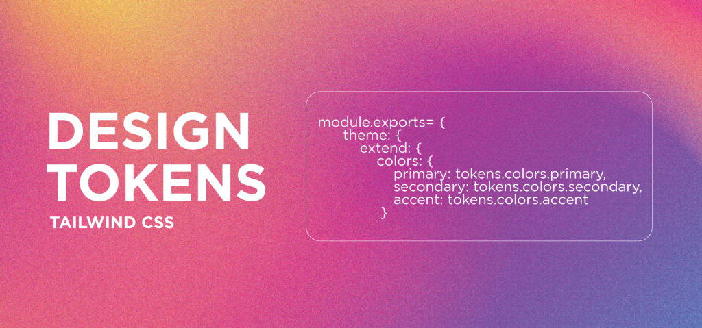
Next, modify the Tailwind configuration file (tailwind.config.js) to include these tokens. This setup ensures that Tailwind CSS uses the values defined in your tokens file.
Example tailwind.config.js:
const tokens = require('./tokens.json');

module.exports = {
  theme: {
    extend: {
      colors: {
        primary: tokens.colors.primary,
        secondary: tokens.colors.secondary,
        accent: tokens.colors.accent
      },
      spacing: {
        small: tokens.spacing.small,
        medium: tokens.spacing.medium,
        large: tokens.spacing.large
      },
      fontSize: {
        small: tokens.fontSizes.small,
        base: tokens.fontSizes.base,
        large: tokens.fontSizes.large
      }
    }
  },
  variants: {},
  plugins: []
};
Step 3: Use Tokens in Your Styles
With your tokens defined and configured in Tailwind CSS, you can now use them in your HTML by referring to the corresponding Tailwind utility classes.
Example HTML:
<div class="bg-primary text-large p-medium">
  This is a div with primary background, large text, and medium padding.
</div>
In this example:
bg-primary applies the primary color as the background color.text-large sets the font size to large.p-medium adds medium padding.Implementing design tokens in Tailwind CSS is a powerful way to achieve a cohesive and efficient design system. By defining tokens in a central file and configuring Tailwind to use them, you ensure that your design remains consistent, scalable, and easy to maintain. Start incorporating design tokens into your Tailwind CSS projects today to streamline your workflow and improve your design system.
Learn how CSS Grid provides a powerful, native solution for building efficient dashboard layouts...
Explore TypeScript's advanced features, type system, and how it enhances modern web development...