Development
Deep Dive into TypeScript
Explore TypeScript's advanced features, type system, and how it enhances modern web development...
Jul 22, 2025 • 2 mins reading
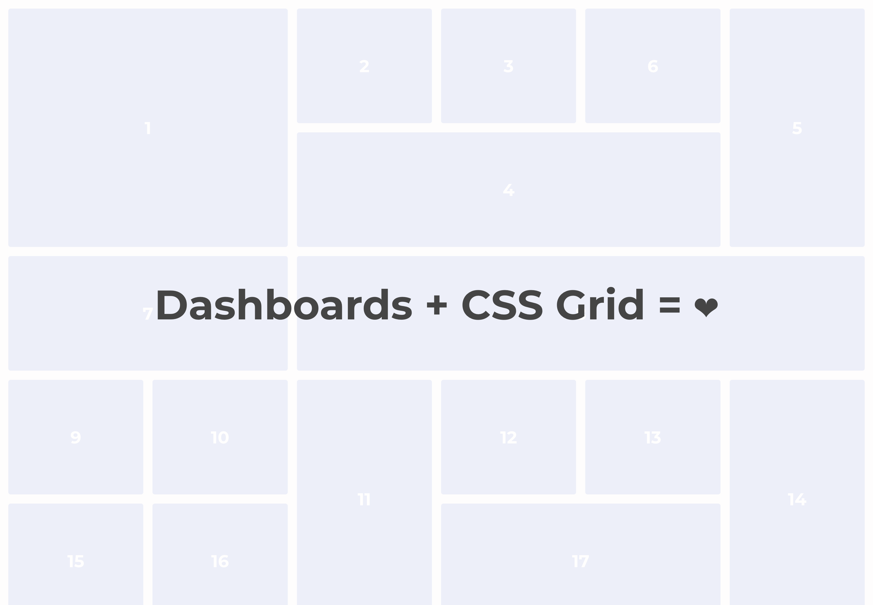
Building a Dashboard Layout Using CSS Grid
by Melina Arias
Businesses love dashboards. You'd be hard-pressed to find a UI engineer who has never worked on building or maintaining a dashboard UI. That is because dashboards embody a desirable promise: presenting valuable insights at a quick glance. Business intelligence (BI) metrics, system status charts, performance tracking over time, and financial metrics are some of the many common use cases that make this kind of user interface so ubiquitous in the business world.
Yet, implementing a dashboard layout is seemingly still cumbersome. If you look at some of the leading dashboard libraries out there, they invariably use CSS Flexbox layout and a bunch of javascript logic to produce their layouts. That is more code to ship and maintain, more processing cycles on the client side, more work to support mobile devices, and often a jankier rendering experience.
Building a Business Intelligence dashboard with off-the-shelf libraries can be cumbersome. CSS Grid is a great solution to that problem.
While those libraries have a lot of benefits beyond a widget layout, when you want something simple that is focused on layout, because you need a lot of control over the content of your dashboard's widgets, there is a great solution built into every modern browser: CSS Grid layout.
Some of the advantages of using CSS Grid are:
• Not shipping any extra code.
• Virtually instantaneous rendering (layout-wise).
• Amazing flexibility in terms of sizing and positioning.
• Pixel-perfect alignment.
• Easily adaptable to different screen sizes.
• No need to learn a new library.
• And complete control of the design and content of each widget.
While those libraries have a lot of benefits beyond a widget layout, when you want something simple that is focused on layout, because you need a lot of control over the content of your dashboard's widgets, there is a great solution built into every modern browser: CSS Grid layout.
What are some of the disadvantages of this approach to building a dashboard?
• No "free" features. Yes, you don't need to learn a new library and its paradigms and APIs, but you also don't gain any of the features and pre-built UIs.
• Layout cannot be animated. Your widgets cannot be animated inside of a CSS Grid — for instance, if a user configures it to have a different size, or moves it around.
• Support is out of your control. While you don't have to ship code for this layout, you also can't control where it's available, and ensure that how this feature is implemented does not change unintentionally. Browser standards should help avoid any major issues, though.
Let's look at how to implement a great dashboard layout using CSS Grid!
The first step is to create the grid itself. We'll use the CSS repeat() function, with the auto-fill property, and a minmax() function to ensure that our grid's columns both fill up the screen and adjust their width automatically.
.DashboardGrid {
  display: grid;
  gap: 16px;
  grid-auto-rows: 200px;
  grid-template-columns: repeat(auto-fill, minmax(200px, 1fr));
}
The repeat() function can be used with a multitude of values. Yes, you can pass in an integer for the first parameter, but that only defines a fixed number of columns for a grid. Instead, by using auto-fill and minmax() we create a grid with an indefinite number of columns. In this case, we squeeze in as many 200px columns as possible, but they'll stretch evenly to take up the full width of the grid.
Here we also set a gap to space out the the dashboard widgets, and we define the height of each grid square as 200px using grid-auto-rows, which allows us to avoid having to set a predefined number of rows — the more dynamic we make this layout, the better!
This is a great grid, BUT… it is prone to gaps if you start adding widgets that are wider and/or taller than 1 cell. Luckily, there's a CSS Grid trick to help avoid gaps:
.DashboardGrid {
  display: grid;
  gap: 16px;
  grid-auto-rows: 200px;
  grid-template-columns: repeat(auto-fill, minmax(200px, 1fr));
  grid-auto-flow: dense; /* The Fix! */
}
By adding grid-auto-flow: dense, we tell the browser to move widgets out of sequence if need be, in order to try to fill natural gaps in the grid. That may not always be appropriate, but if you want your dashboard to adapt to many screen sizes and still look good, this is probably the way to go.
The last step is creating the container for the dashboard widgets.
.w1 {
  grid-column: span 1;
}
.w2 {
  grid-column: span 2;
}
.w3 {
  grid-column: span 3;
}
.w4 {
  grid-column: span 4;
}

.h1 {
  grid-row: span 1;
}
.h2 {
  grid-row: span 2;
}
.h3 {
  grid-row: span 3;
}
.h4 {
  grid-row: span 4;
}
For a dashboard, you don't need a wide range of widget widths and heights, especially with a grid with large cells. This gives us a range of rectangular sizes from 1 x 1 to 4 x 4, and everything in between.
But the final step is making these widgets adjust to different screen sizes. We do that by reducing widget sizes progressively, the smaller the screen size gets. With 200px cells, we don't need to even reduce wider widgets to a single cell, but you can tweak the resizing strategy to your needs — remember, using a CSS Grid here gives us a lot of flexibility.
@media only screen and (max-width: 1399.998px) {
  .w4 {
    grid-column: span 3;
  }

  .h4 {
    grid-row: span 3;
  }
}
@media only screen and (max-width: 1099.998px) {
  .w3 {
    grid-column: span 2;
  }
  .w4 {
    grid-column: span 2;
  }

  .h3 {
    grid-row: span 2;
  }
  .h4 {
    grid-row: span 2;
  }
}
@media only screen and (max-width: 599.998px) {
  .w2 {
    grid-column: span 1;
  }
  .w3 {
    grid-column: span 1;
  }
  .w4 {
    grid-column: span 1;
  }
}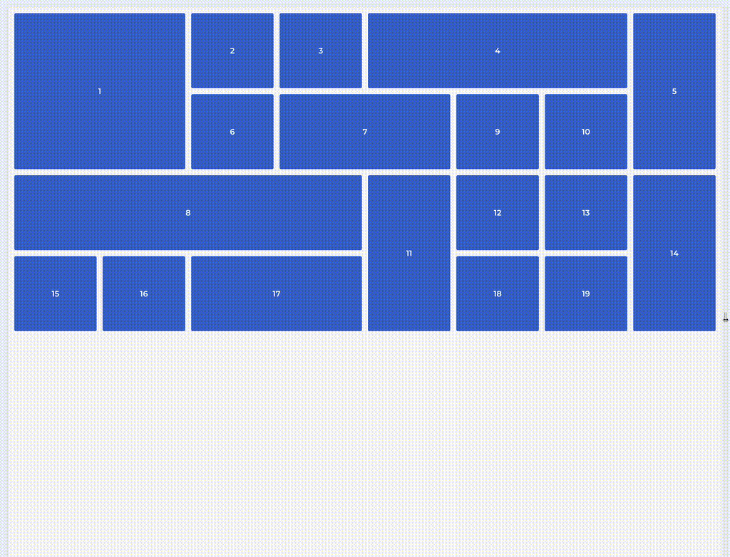
That's a really nice looking, fast rendering dashboard layout!
You could easily implement this in a framework like React, where a Widget component could accept width and height props and be rendered with the styles above. From there… it's up to you, but that's the beauty of this approach: you have full control over look and feel, and this will get you up and running quickly.
If you want to see and play around with some code, here's a code pen with a pure HTML + CSS implementation based on the code samples in this article.
CSS Grid provides a powerful, native solution for building dashboard layouts without the overhead of additional libraries. By leveraging repeat(), auto-fill, minmax(), and grid-auto-flow: dense, you can create flexible, responsive dashboard layouts that adapt beautifully to different screen sizes.
The approach offers significant advantages in terms of performance, simplicity, and control, while the trade-offs are manageable for most use cases. With CSS Grid, you get pixel-perfect alignment, instant rendering, and complete design control — all without shipping additional JavaScript or learning complex library APIs.
As browsers continue to improve their CSS Grid implementations, this native approach to dashboard layouts will only become more compelling for developers who prioritize performance and simplicity in their user interfaces.
Explore TypeScript's advanced features, type system, and how it enhances modern web development...
Learn how design tokens and Tailwind CSS can help you build cohesive and maintainable design systems...