
Understanding React’s Virtual DOM: A Key to Performance Optimization By Krishna Desai
React is a popular JavaScript library developed by Facebook that has revolutionized the way we build user interfaces for web applications. One of the core features that sets React apart from other frameworks is its use of the Virtual DOM, an efficient mechanism that helps optimize performance and improve the user experience. To understand why this concept is crucial for React and modern web development, it's important to first understand what the DOM (Document Object Model) is and how it works.
What is the DOM?
The DOM is essentially a representation of the web page, structured as a tree of elements (like HTML tags). Every time a change occurs in the UI (such as a button click or form submission), the browser must update the DOM to reflect the new state of the page. However, frequent updates to the DOM can be costly in terms of performance, particularly when the page is large and complex.
In traditional web development, when the DOM is updated, the browser has to go through several steps: re-render the page, recalculate styles, and reflow or repaint the elements. For larger, dynamic applications, this can lead to a noticeable lag or delay in how the application responds to user interactions.
Enter the Virtual DOM
The Virtual DOM (VDOM) is a lightweight copy of the actual DOM. It exists entirely in memory and allows React to perform most of its work before making any changes to the real DOM. Instead of updating the actual DOM every time there’s a change in the state of the application, React first makes the change in the Virtual DOM. Once the update is complete, React compares the new Virtual DOM with the previous version, calculating the minimal set of changes that need to be made to the real DOM.
This process is known as reconciliation. The idea is to minimize the number of updates to the real DOM by batching changes and applying them in an optimized way. The goal is to keep the user interface responsive and fast, even for complex, data-driven applications.
How Does React's Virtual DOM Work?
Here’s a step-by-step breakdown of how React’s Virtual DOM works:
-
Initial Render: When the application is first loaded, React creates a Virtual DOM that mirrors the structure of the real DOM, which reflects the HTML of the page.
-
State Changes: When an event occurs (like user input or an API call), the component's state changes. React then updates the Virtual DOM to reflect the new state.
-
Diffing: React compares the new Virtual DOM with the old one to identify what has changed. This comparison process is known as "diffing."
-
Reconciliation: Based on the diffing algorithm, React calculates the most efficient way to update the real DOM. Instead of re-rendering the entire page, React only updates the parts of the DOM that have changed, reducing the work required by the browser.
-
Update the Real DOM: Finally, the necessary updates are applied to the real DOM. Since only the changed parts are updated, this process is far faster than a full re-render.
The Benefits of the Virtual DOM
There are several significant benefits to using the Virtual DOM in React:
-
Performance: By reducing the number of direct updates to the real DOM, React minimizes the computational cost of rendering a page. The Virtual DOM allows React to perform updates more efficiently, resulting in faster rendering times and a smoother user experience.
-
Predictability: Because React’s Virtual DOM operates on a declarative model, developers only need to describe how the UI should look for a given state. React handles the underlying updates, making the development process more predictable and easier to manage.
-
Cross-Platform Compatibility: The Virtual DOM abstracts the underlying details of the platform it is running on, which makes React applications highly portable. This means React code can be used for web applications, mobile apps (via React Native), and even desktop applications, with minimal changes.
-
Improved Debugging: The Virtual DOM's predictable behavior makes it easier to debug issues. React’s component-based architecture allows developers to isolate problems to specific parts of the UI, which can help them troubleshoot and fix issues faster.
Virtual DOM vs Real DOM: A Comparison
Let’s compare how the Real DOM and Virtual DOM work side by side:
| Feature | Real DOM | Virtual DOM |
|---|---|---|
| Speed | Slow due to frequent updates | Fast due to fewer updates to the real DOM |
| Memory Consumption | Higher, because of frequent reflows | Lower, as changes are first made in memory |
| Update Process | Direct manipulation of the DOM | Efficient update with diffing and reconciliation |
| Efficiency | Less efficient in complex applications | Highly efficient, especially for large UI |
React’s approach to managing DOM updates is especially helpful in large-scale applications where performance can be a concern. For example, in applications with complex user interactions or those that require frequent data updates—such as social media feeds, financial dashboards, or collaborative tools—the Virtual DOM makes a noticeable difference in responsiveness and user satisfaction.
Conclusion
In conclusion, the Virtual DOM is one of the key innovations that make React such an effective tool for building dynamic, high-performance user interfaces. By using the Virtual DOM to minimize direct updates to the real DOM, React enables smoother rendering, faster performance, and a more efficient development workflow. As web applications continue to grow in complexity, React’s Virtual DOM will likely remain one of the primary reasons why React is favored by many developers around the world.


 The future of web development in 2025 is exciting and full of possibilities. With AI-driven coding, high-performance WebAssembly applications, and the rise of Edge Computing, developers have more tools than ever to build fast, efficient, and scalable applications. Staying ahead of these trends will be key to remaining competitive in the evolving web landscape.
 In this example, we create a card with an image, text, and a button using MUI's Card component.
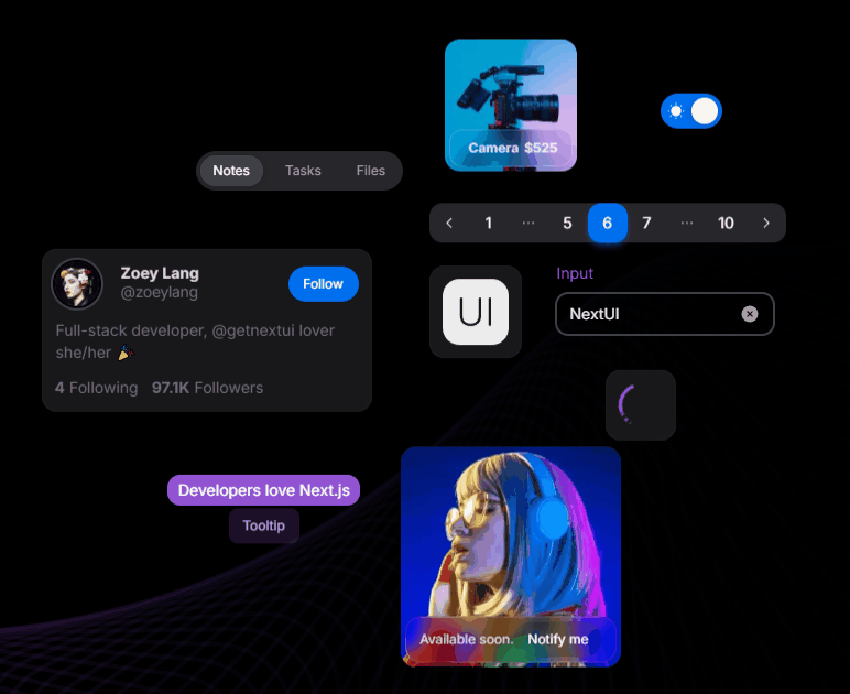 Next UI is a modern, lightweight library focused on simplicity and performance. It offers an elegant design system ideal for building responsive, sleek UIs without sacrificing speed.
Pros:
Next UI is a modern, lightweight library focused on simplicity and performance. It offers an elegant design system ideal for building responsive, sleek UIs without sacrificing speed.
Pros:
 You can run this example
 Pros:
Pros:
 Using Tailwind's utility classes, you have fine-grained control over the layout.
 Pros:
Pros:

 Pros:
Pros:
 Tailwind CSS Tools - A Perfect Match for Custom Components
If you're already familiar with Tailwind CSS, tools like Tailwind UI and DaisyUI can be excellent additions to your workflow. They offer pre-designed components that you can fully control and modify to match your project needs. Since both are based on Tailwind, you can easily extend or modify the components, giving you the power to create abstracted and reusable UI elements without losing control over the design and behavior since you will need to create the components yourself.
Tailwind CSS Tools - A Perfect Match for Custom Components
If you're already familiar with Tailwind CSS, tools like Tailwind UI and DaisyUI can be excellent additions to your workflow. They offer pre-designed components that you can fully control and modify to match your project needs. Since both are based on Tailwind, you can easily extend or modify the components, giving you the power to create abstracted and reusable UI elements without losing control over the design and behavior since you will need to create the components yourself.
 Pros:
Pros:
 React-Bootstrap's Grid system allows for quick and easy layout creation.
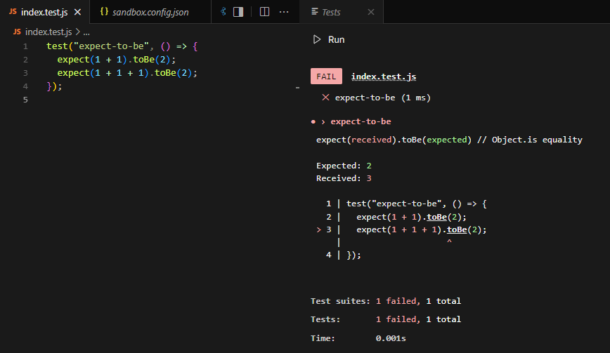
 Why is this important? Well, even if 99% of your car is working, if one wheel is faulty, the whole car won’t drive smoothly (or at all). The same goes for code: if one function breaks, it could cause bigger problems down the line.
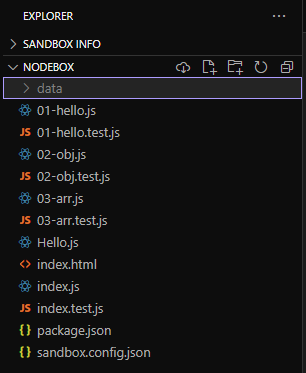
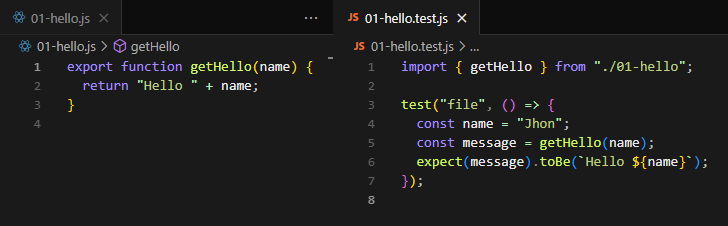
 In software, integration tests ensure that different modules or components of your application play nicely together. This is important because even well-written individual pieces of code can still cause errors when they interact in unexpected ways.